Rule sets address patterns and exceptions. They improve productivity of implementation and they ensure consistency, which improves usability.
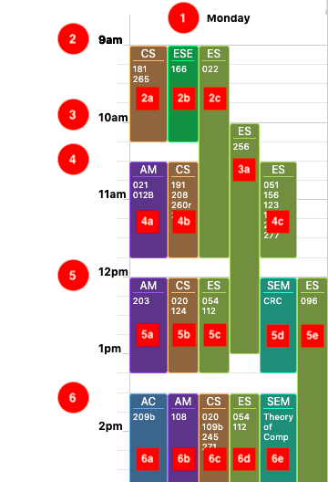
Priority sequence
- Day of the week
-
First hour block
- Courses of first hour block
-
Second hour block
- Courses of second hour block (on any available space non occupied by the courses of the previous hour block)
-
Third hour block
- Courses of third hour block (on any available space non occupied by the courses of the previous hour block)
- Etc.
"Automatic" sequence
According to the above priority sequence, courses would populate each time block in alphabetical order.
- Courses populate each time block in alphabetical order
- Courses placement is affected only by the previous time block(s)
- Courses placement is not affected by the following time block
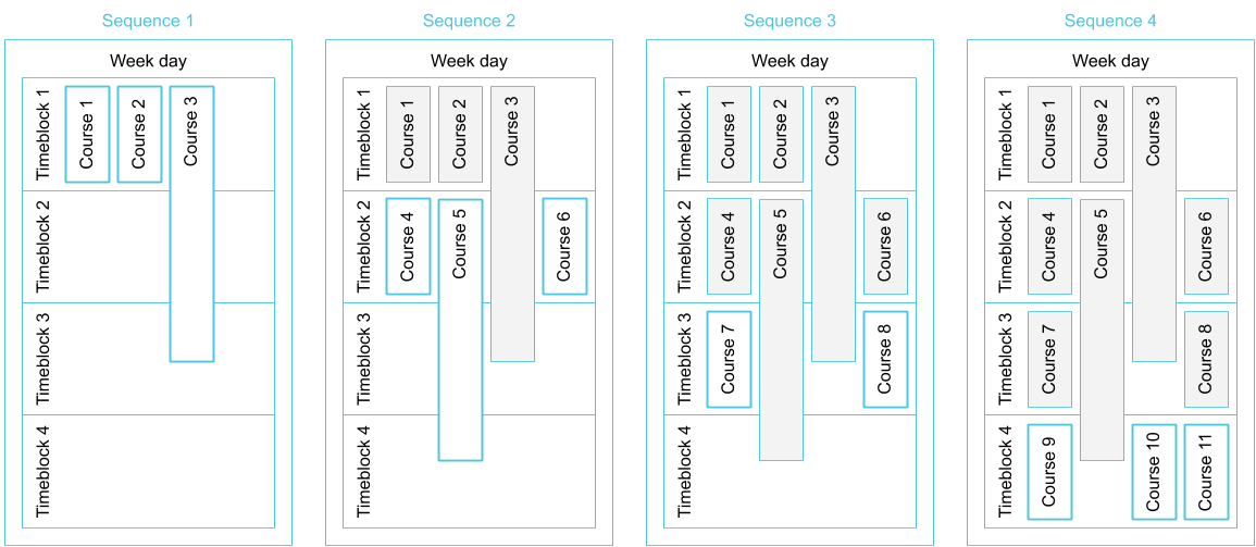
This rule set doesn't make the best use of the space.
"Logical" sequence
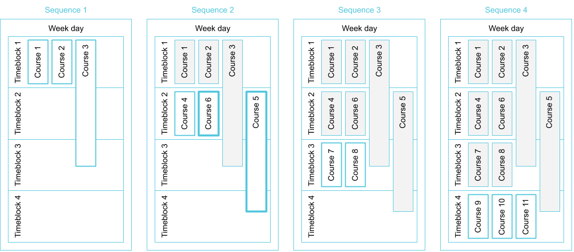
These rules maximize the available space within a time block and improve the readability of courses by reducing visual inconsistency.
- Courses populate each time block in alphabetical order
-
Courses populate each time block in order of length
- Courses with the greater length are placed as last within each time block
- Courses placement is affected only form the previous time block(s)
- Courses placement is not affected by the following time block
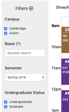
- Dropdowns are used for the selection of 3 or more options
- For two or less selections, use checkboxes or radio buttons
- Note that interfaces like toggle switches are stylized radio buttons
When selecting a link, users expect to "jump" to content different than the current one (even though contextually the same).
Use icons with text labels or as links only when they helps to clarify ambiguities. Otherwise the context and descriptive text are sufficient.
Links are used to connect content areas:
- Relative pages of content (same directory, project)
- External pages of content
- Content within the same page (anchor links)
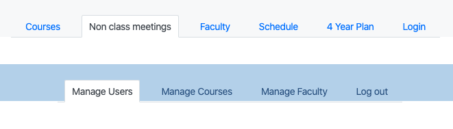
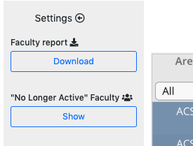
When selecting a button, users expect for some programmatic activity to take place and eventually display its results.
Buttons should not to be used to emphasize links.
Use icons as buttons or with buttons only when it helps to clarify ambiguities. Otherwise the context and button label are sufficient.
Buttons are used to "process" information or to trigger changes of the content
- Submit or cancel a selection or input text
- Reveal hidden information*
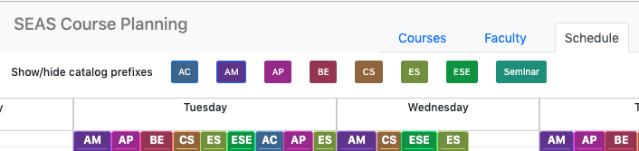
- Change the aspect of content (courses schedule)
Ultimately, these are "visual rules" based on "superficial" usability; the user is exposed to the same experience whether the action of one button streams data from the back-end and doing all kind of processing to finally display the result, while another just un-hides static information.